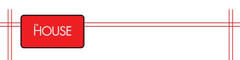
Should I Revamp... into THIS?
From the LOGO shown ABOVE to the one shown below??


I need comments and recommendation please...... This above design showcases new image.
Pro-
Directly targeted at gentlemen.
Neg-
Cost of re-doing the old image, from name cards, labels and the current image that clients have already embedded in their minds.
Launching THE HOUSE OF LADIES will be a headache, the design and logo doesn't fits exactly what I wanted initially.
The House which is the main brand and gentlemen, ladies and fashion will be the subset. Just like Singtel, Virgin ... Personally I prefer red colour as it is always the leading colours in BIG COMPANIES!
Heachache Should I change? or not?
Everything will be revamp in a month time, yes .. a fucking beta blog .. lol

0 Comments :
Post a Comment
Subscribe to Post Comments [Atom]
<< Home